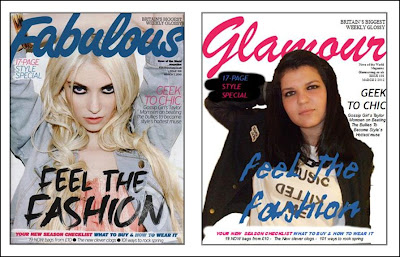
To get myself familliar with photoshop and how it works I decided to make a practice ancilliary using the magazine I'm going to use as a template for where the masthead and sub titles needed to be placed. I feel that this helped me to fully understand the conventions of a magazine.
I used a "classy" magazine to try and mimic and I think that I did quite a good job of it.
I cut out the image in photoshop first and then I added in the masthead and the main sub title. I used a brush stroke in photoshop to get that paintbrush look on the bottom and the left hand corner of the magazine. I then transferred the image over to publisher where I added more text because I find it easier to do it that way.

No comments:
Post a Comment